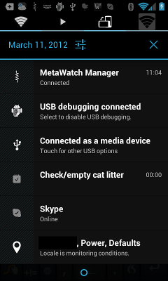
So, hands up if your notification bar looks like this…

I see similar levels of clutter when other people show me their phones, and this just isn’t a good user interface. These icons mean all kinds of different things, and the level of urgency of each one is really not clear. They’re just ordered by most recent update first. On CyanogenMod I can turn off the clock to fit all 9 of them in, but really, a lot of them shouldn’t be here.
There’s an excellent Android Design article on notifications, highlighting many of the common reasons for notification clutter. If you see one of those anti-patterns, you should definitely bug the app developer about it (by email please! - again, we can’t reply to Market comments), but that’s not what’s happening here. Let’s look through them shall we? (I clicked in a text box, so now there are 10.)
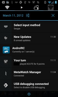
Actually notifying me
- TweakDeck
- WordFeud
- Remember The Milk
System (understandable?)
- Select input method
- USB debugging
- USB/MTP
Background services
- AndroIRC
- MetaWatch Manager
- Skype
- Locale
Now we can see: 3 I really want, 3 system ones that aren’t really notifying me of very much, and the other 4 are just background services that I really want to keep running. Apps like that have to show a notification, even if they’ve nothing to say, to avoid being killed, in line with an API change that was made in Android 2.0 (and here’s the relevant API doc.
I think that was the right decision for Android at the time. As that article says, there was very much a tragedy of the commons problem with background services before then, with every app declaring itself to be high priority, the platform unable to make good decisions about what to kill, and users getting the short straw with slow phones where the apps they wanted to keep running would keep getting killed. So with that change, apps had more incentive to limit their use of background services, and users were much more likely to notice and take action when an app they didn’t want was hogging resources.
The problem now is that this phone has a dual-core 1.2GHz chip and 1GB of RAM, and can happily run much more stuff in the background than can sensibly be prominently displayed to the user all the time (a nice problem to have). It means there really needs to be a better UI for managing background functionality. I don’t have a definite answer to this problem, let alone a plan to migrate all the existing background apps to it, but here are a couple of ideas:
- Ditch these notifications in favour of the “Running” tab under “Manage apps”, which could perhaps be surfaced as a second tab of the notification drawer? Or just a shortcut to it on that top line with the date?
- Remove their icons from the status bar, and keep them in the drawer, at the bottom, in a dedicated section which by default is collapsed to just icons. Have an expand/collapse button, and persist that state.
A big difficulty here is identifying which notifications serve no other purpose. Often a notification on which startForeground() is called is also displaying useful information, or acting as a shortcut for something that the user will frequently want to switch to without using the home screen. The second idea above seems safe-ish to apply to ongoing notifications from existing apps where a custom layout is not used, but you might have one app whose detail text you really want to see, and then you have to keep the whole thing expanded all the time. Still, even putting non-ongoing notifications first seems like an improvement to me.
For myself, I might put a band-aid on it by adding a CyanogenMod option to hide the icons of ongoing notifications from the status bar. Even then, I’d like the pull-down drawer to at least prioritise notifications that are, y’know, notifying me.
Better ideas, anyone? Bueller?